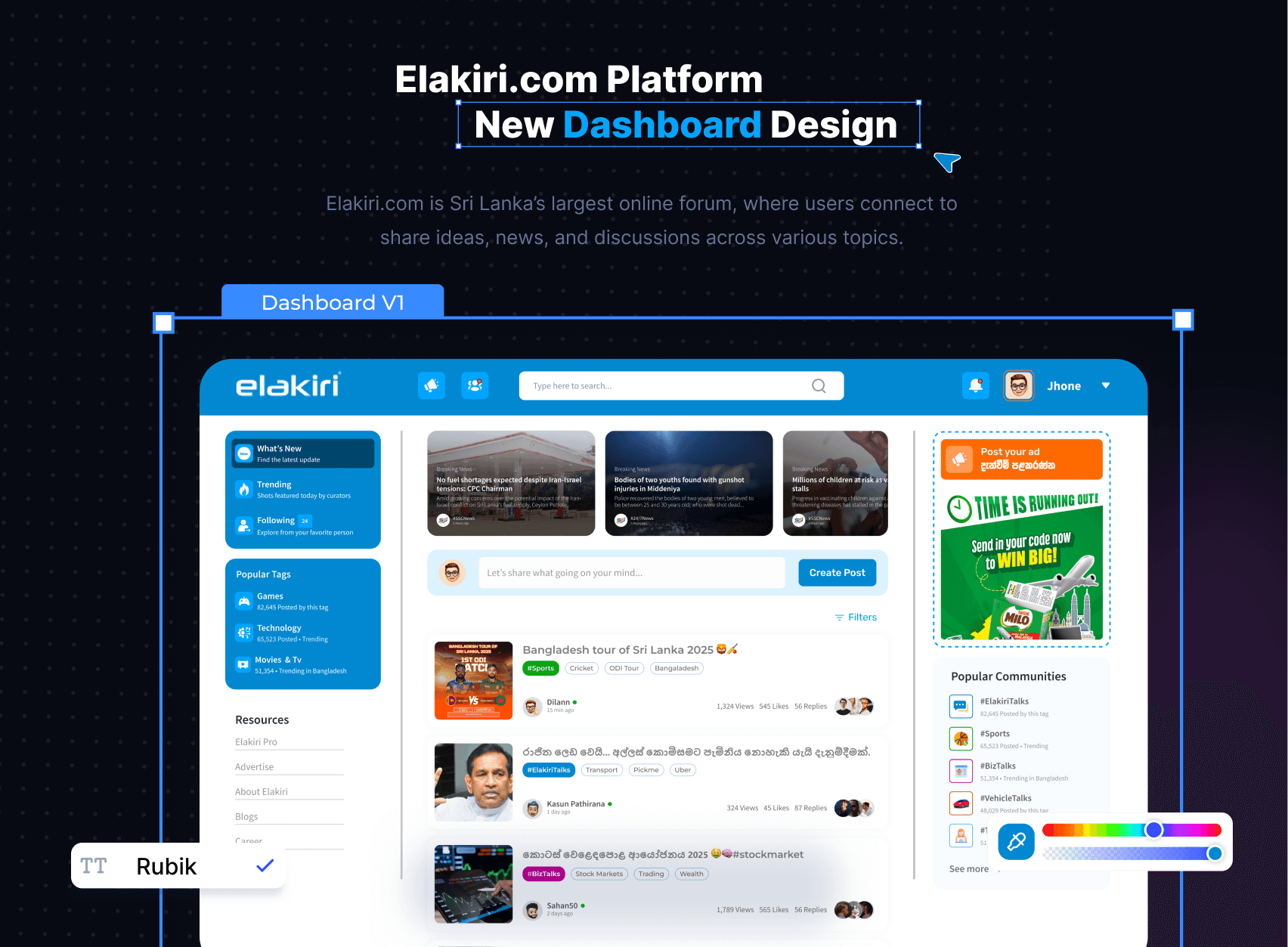
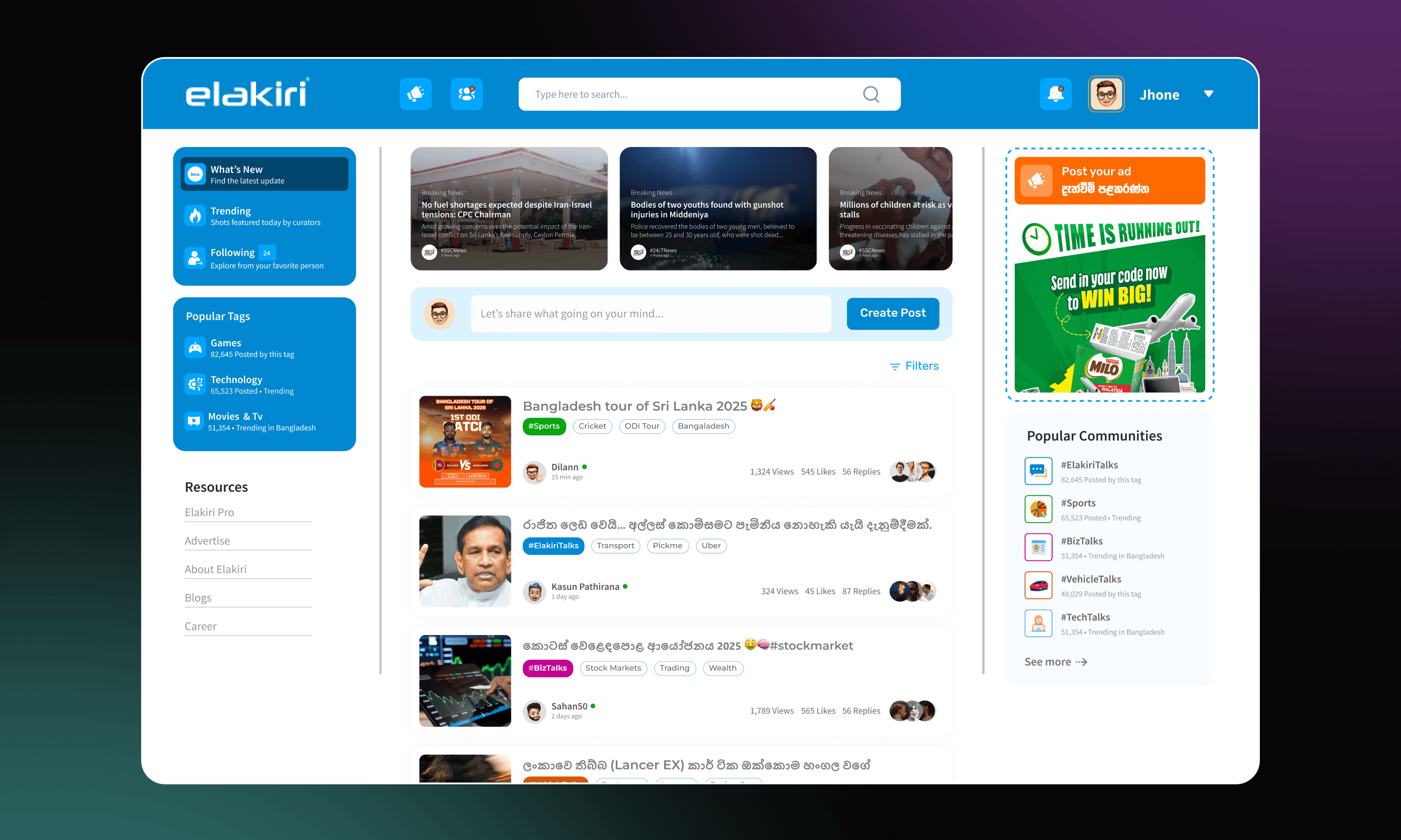
Elakiri.com is Sri Lanka’s largest online forum
Elakiri.com Platform
New Dashboard Design
What was wrong with the old design?
Elakiri.lk is a well-known online forum in Sri Lanka, but its interface had become outdated and overwhelming. Key issues included a cluttered layout, poor navigation, and low engagement. Users struggled to find trending posts or post ads easily, resulting in a 78% drop in engagement.
The main goal:
👉 Create a simpler, more intuitive platform that keeps the forum feel alive while boosting engagement and making ad placements feel more natural.
Project Scope
Timeline
1 Week
How I approached it:
Before jumping into visuals, I focused on user pain points. I explored the current platform from a user's perspective to understand common frustrations like messy navigation, poor content prioritization, and scattered UI elements.
I started by:
Mapping user journeys (reading > posting > exploring)
Identifying high-friction areas (especially in the ad and post sections)
Prioritizing UX clarity before UI styling
Constraints I worked with:
The community tone needed to stay intact
Ads had to remain but feel less intrusive
The design needed to work on both desktop and mobile smoothly
I focused on clean layout, logical flow, and smart content hierarchy to bring ease and modernity into the user journey.
How did it help?
I shared the new design with a small group of active users and peers. The feedback was clear — users felt more confident, less distracted, and more willing to engage.
Key results based on mock feedback:
Increased time spent on threads
More interest in posting and commenting
Ad sections were better received
Some user reactions:
“Much easier to find what’s trending.”
“I feel like posting again after a long time.”
What changed in my approach:
Initially, I aimed for visual clarity. But after user testing, I realized deeper UX issues — like hidden navigation patterns and poor content flow — were the real blockers.
Biggest lesson: Listen to real users early. Their feedback shifted the design in the right direction.
What I’ll take forward:
Validate assumptions with actual feedback
Build UX foundation before thinking visuals
Always leave room to iterate and evolve


